TAMBURINS’ Seoul Hannam Flagship and the Brand’s Tribute to Taditional Korean Culture
You might have seen my June post about the South Korean fragrance & lifestyle brand TAMBURINS – long story short, I love it. That specific article is about their Seongsu flagship, and I’ve also been to their Sinsa location (more about that here). So when I ened up passing by their Hannam store I did not think I will see anything I new – and boy, was I wrong!
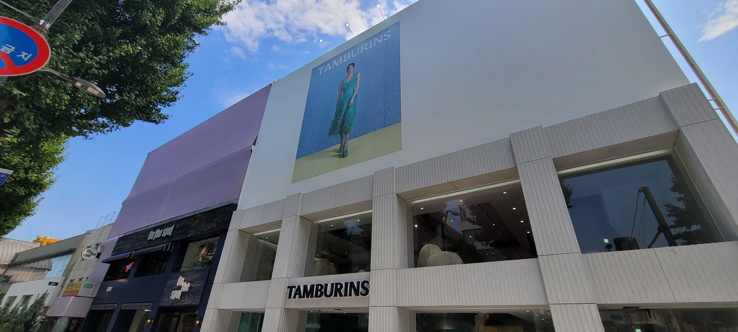
The Hannam street where the TAMBURINS flagship is located
The flagship is a three story building, the first flor dedicated to the whole offer and the second floor dedicated to an activation around the home fragrance line, while the third floor was currently closed off to the public.
The biggest takeaways from my store tour:
DIVERSIFY THE STORY TELLING WHILE ADHERING TO THE BRAND DNA – The first thing that I noticed was a huge picture of Jenny from BLACK PINK in a green outfit hung over the façade. I’ve visited multiple brand locations throughout the past year and that color was new to me – indicative of a different story.
Jenny in a green dress – so far I only saw the same collection shots in different outfits
It all made sense when I came closer as I noticed the green color dominating the first floor interior – the walls were covered in knit texture fabric and there were multiple large sized pumpkin shaped objects throughout the room. Also, the green theme is reserved for this store while the Shanghai flagship has white pumpkins and the Tokyo flagship has pumpkins with red elements. Why pumpkins, you might ask? One of the main fragrances is named Pumpkin!
MENGLING YI at HAUS NOWHERE SHANGHAI | Source: TAMBURINS Official Instagram Account
AYAKA MIYOSHI at TOKYO AOYAMA FLAGSHIP STORE | Source: TAMBURINS Official Instagram
KEEP SOME COMMON DESIGN ELEMENTS TO TIE TOGETHER DIVERSE STORIES – the silver cloud-like table tops and the wooden counters are the same as in other locations. However, the pumpkin-shaped leg on the table is specific to this store design. As mentioned above, something as simple as having shot the campaign with Jenny in multiple outfits helped allow for different approaches. And of course, the concrete beams – so stunning left completely bare without floors and walls at the Seongsu store
The cloud shape is a common design element
Similar counters can be seen in other stores
The cut wood is another common interior design element
BUILD ON LOCAL HISTORY AND ENGAGE WITH LOCAL ARTISTS AS PART OF THE STORYTELLING – The second floor is what really floored me (I’m sorry, I can’t help myself with these puns). We’re greeted by two traditional Korean paintings, with one more deeper into the room, featuring cute puppies relaxing in the an interior garden – called madang – of a traditional Korean house, called Hanok.
Art by the Korean artist SuYeon Kwak (곽수연)
Native Korean dog, Sapsalgae chilling in the inner garden – madang – of a traditional Korean house, Hanok – and his friend surrounded by The Four Tools of the Study
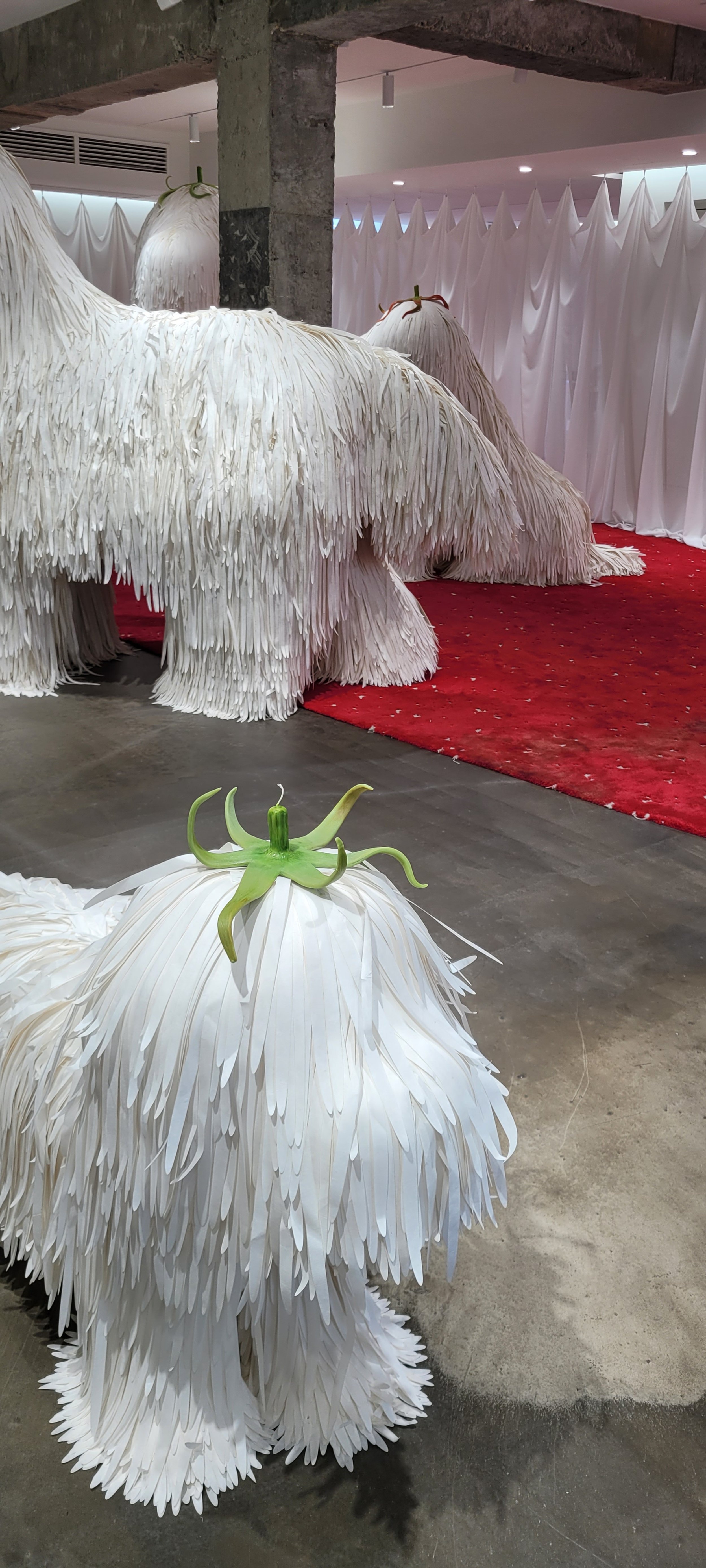
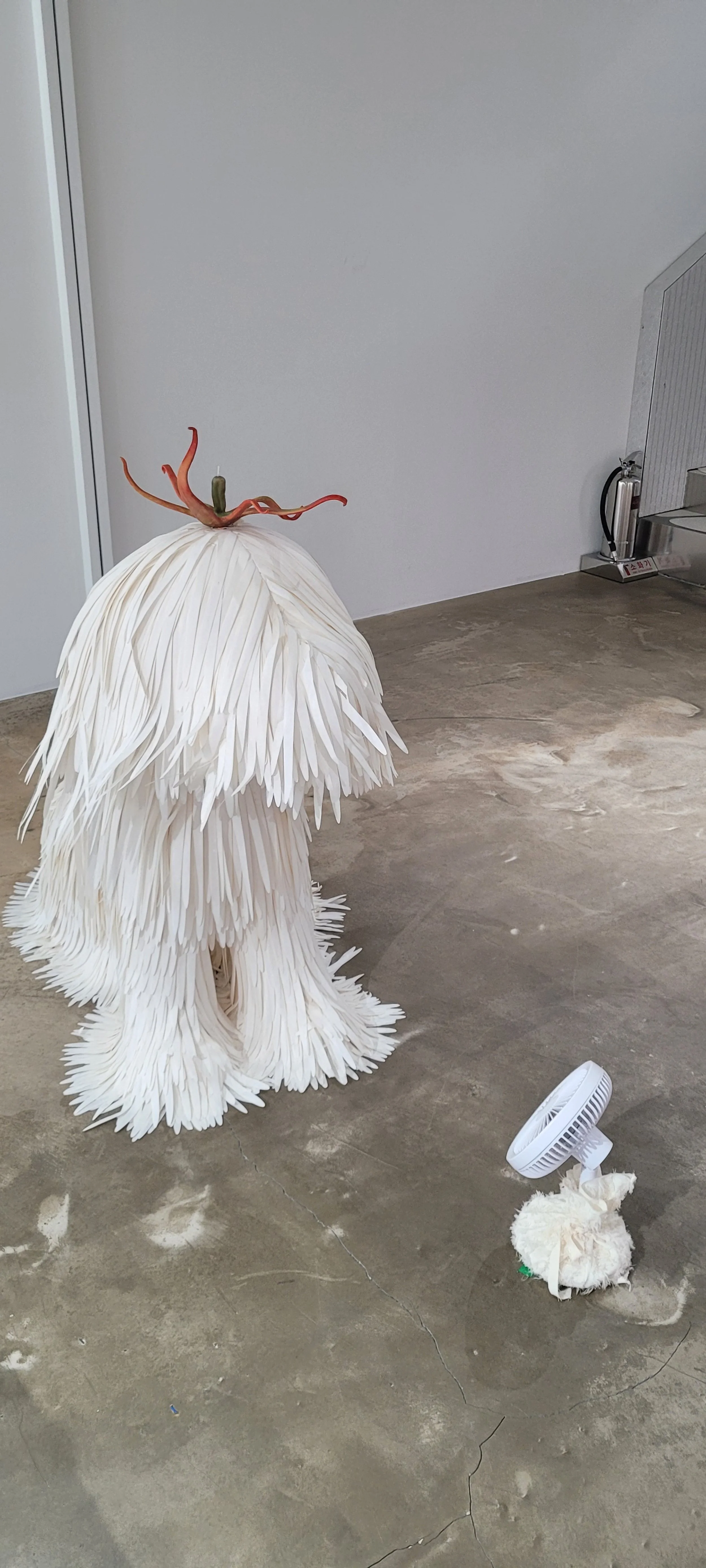
Just next to it we have these huge puppy sculptures with their fur made of traditional Korean mulbery paper, Hanji, their heads topped with wax objects bringing to mind the calyxes (smart word I just looked up – the little ‘hat’-like bits that connect the fruit/vegetable to the stem of the plant) of the pumpkins dowstairs.
I spoke to one of the wonderful Client Advisors (I love it when the staff is approachable, helpful, and kind!) about the store design and she explained the concept behind the art and paper puppies. One of the the room scents is named Meok, which means ink, and so the setting was inspired by ‘문방사우’ - The Four Tools of the Study i.e., the four items a scholar should always keep close by: a brush, ink, paper, and an inkstone.
More mulberry paper dogs and another art piece by SuYeon Kwak in the background
Lots of doggos enjoying their little fans and another Eastern painting brush
The idea was to invoke the atmosphere of the Choseon Dynasty period, obviously with a modern twist. The featured artwork was created by the Korean artist SuYeon Kwak (곽수연) and she painted a ‘삽살개’ – Sapsalgae, also called Sapsari, a native dog of South Korea that was widely found in the southeastern part of the Korean Peninsula. The dog in the large painting was chilling in front of a small fan and so the sculptures around were also surrounded by little fans, which made the mulberry paper hair move with the air. And one of my favorite bits were the Eastern painting brushes covered in ink splatters, one of them laying on the cloud shape we are already very familiar with.
An Eastern painting brush laying on a cloud-shaped object
MAKE EVERY ASPECT OF THE SPACE AND EVERY DETAIL WORK FOR YOU – attention to detail is a must if you want to be considered a ‘higher shelf’ brand, as we call premium/luxury brands in Polish. I love that the best Korean brands make full advantage of every aspect of the interior and space – the staircase design is consistent with the rest, furniture is taken as an opportunity to really play around with the theme – like the mulberry paper-wrapped product display table, typically metal in other parts of the store
The table showcasing the room scents was wrapped in mulberry paper and Casper Kang’s painting in the background
The mulberry paper from up close – you can see its lovely strong texture
BE A PATRON TO ARTISTS IF YOU CONSIDER YOURSELF A CULTURAL PLAYER – on the second floor we also have a painting by Toronto-born and Seoul based artist Casper Kang – I’ve seen his work at the Sinsa and Dosan Park flagships before, as well as the Spanish artist José Lerma. I would love to add that the Client Advisors have all of this information made accessible in their internal app so they don’t feel lost when individuals like myself shower them with non-product related questions.
Art by José Lerma on the first floor and the gorgeous stairs
TRAIN STAFF TO FOCUS ON STORE EXPERIENCE AND GIVE THEM ACCESS TO DIVERSE TOOLS TO BOOST THEIR CONFIDENCE – as I already mentioned above, the Client Advisors were a dream to engage with. That’s one thing that I have noticed visiting Korean brand stores over and over again – experience is king. No pressure to purchase, take all the time you want taking pictures – of yourself or the store. And they answer all of my questions about the brand, some with authentic pride – they really seem to like their job. I’m sure it’s part of the training and I truly appreciate it. I’ve had not-so-great experiences at some Western luxury brand stores and it’s honestly a shame because it diminishes all the hard work that goes into putting these spaces together.
And of course – give your people the right tools. I asked about every painting in the store and whatever the staff wasn’t able to recall right away they could look up in whole articles on the internal brand app to show me. I thought it was amazing that so much resource was dedicated to storytelling, in line with the enormous investment put into creating the space in the first place.
I already knew that GENTLE MONSTER and TAMBURINS are able to tell diverse stories that still don’t lose sight of the brand’s DNA. This unique expression of creativity still managed to make me appreciate them even more.
P.S. THE PROMISED TAMBURINS SINSA FLAGSHIP STORE PICTURES
As the store is quite small it doesn’t warrant its own dedicated post – but just for you, a few picutres of the interior I took in December 2023 and the incredibly cool animatronic they have which just really looks like a live horse.


